


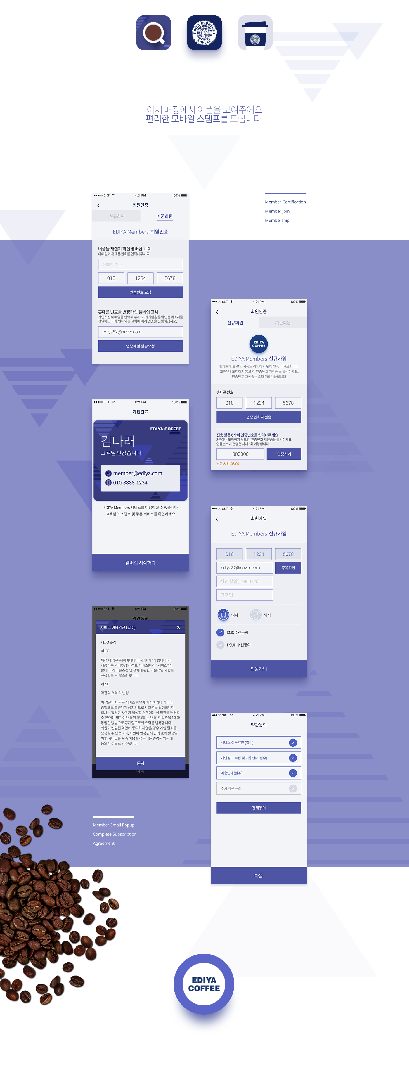

Overview
종이쿠폰의 불편함을 해결하고 매장에따라 다르게 제공되었던 스템프 서비스를 통합하여 앱에서 모든서비스를 받고 관리하여 사용자에게 편리함을 제공하기 위해서 제작되었습니다.
Ediya Keyword
정직 + 즐거움 + 친근함
DesignDirection
최신 트랜드에 맞게 플랫하고 싶플한 디자인으로,
전체적으로 파스텔톤으로 사용자브랜드 경험의 연속성에 방해 받지 않도록 블루계열 컬러를 활용하고 패턴등의 사용으로 젊은감성에 어필할 수 있도록 합니다.
-
Trend : 최신 트랜드를 반영, 플랫하고 심플하며, 원형쉐입을 활용.
Ediya : 젊고 편하게 즐길수 있는곳, 브랜드아이덴티티 컬러 활용, 패턴이나 일러스트 요소들을 활용하고 친근함을 유지 하기 위하여 파스텔톤을 유지.
App Research : 오프라인 경험 연장선, 오프라인 경험의 연장될 수 있도록 종이쿠폰의 메타포를 활용.
Review
이디야 앱의 큰 키워드는 편안하고 친근함 이였습니다.
다른 커피는 비싸지만 이디야 커피는 동네의 가로등 처럼 친근하고 편안한 이미지를 강조할수 있는 방법에 대한 고민을 하였습니다.
그래서 컬러는 기존의 이디야 블루컬러만 사용하기 보다는 낮은채도의 옅은 배경과 블루 & 보라색 계열의 부드러운 파스텔톤의 컬러를 주조색으로 사용하였습니다,
오브젝트는 둥근 요소를 주로 사용하였고 패턴이나, 컬러가 있는 그림자 들로 옅은 조명 빛의 느낌과 감성을 표현 하였습니다.
클라이언트, 개발, 디자인, 퍼블리셔가 서로의 전문성을 인정해줘서 순조롭게 진핼되었던 프로젝트였고 결과 또한 만족스럽게 생각합니다.
물론 가장 큰 힘은 열심히 디자인 잘해주는 동료이고, 옆에 그런 동료가 있어서 항상 든든하고 고맙고 축복 받은 일이라 생각합니다.
-
Overview
Solve the inconvenience of paper coupons and stamps to integrate the service was provided differently depending on the stores receive all services in management app designed to provide convenience to the user.
Solve the inconvenience of paper coupons and stamps to integrate the service was provided differently depending on the stores receive all services in management app designed to provide convenience to the user.
Ediya Keyword
Honest + Fun + Friendliness
Honest + Fun + Friendliness
DesignDirection
Flat to the latest trends and sippeul and use the color blue system to ensure uninterrupted continuity of your brand experience to a whole pastels and the ability to appeal to young sensibilities of the use of such patterns.
Flat to the latest trends and sippeul and use the color blue system to ensure uninterrupted continuity of your brand experience to a whole pastels and the ability to appeal to young sensibilities of the use of such patterns.
Trend: reflect the latest trends, flat and simple, and leverage the circular sweip.
Ediya: young and comfortable place to enjoy, leveraging brand identity, color, pattern, utilize and maintain the element illustration pastel to maintain intimacy.
App Research: extension of offline experience, utilizing the metaphor of a paper coupon to be an extension of offline experience.
Review
Keywords for this great Ediya app was comfortable and friendly.
Other coffee is expensive but Ediya has to worry about how you can emphasize the image like a comfortable neighborhood streetlights.
Keywords for this great Ediya app was comfortable and friendly.
Other coffee is expensive but Ediya has to worry about how you can emphasize the image like a comfortable neighborhood streetlights.
So graphical representation also has a color using the color of soft pastel tones of light blue & purple background and family rather than using a lot of existing Ediya blue as the main color,
The objects were primarily used to express emotions were rounded elements such as light illumination light into shadow pattern or color.
The objects were primarily used to express emotions were rounded elements such as light illumination light into shadow pattern or color.
Client development, design project was jinhael smoothly letting publishers were recognized expertise of each result also think satisfactorily.
Of course, the greatest force is hard to design good fellow, one should think that in the next fellow who is always thankful and reassuring blessings.
Of course, the greatest force is hard to design good fellow, one should think that in the next fellow who is always thankful and reassuring blessings.
news
Over 1 million users of Ediya Coffee mobile app
Over 1 million users of Ediya Coffee mobile app
Ediya Coffee said that the mobile membership service "Ediya Members" attracted one million subscribers within three months of launch.
GUI
Mi-hye Je, Seung-hyun Kang
Mi-hye Je, Seung-hyun Kang
Publishing
Hyeong-gil kim
Hyeong-gil kim